J.Fisher Interiors · Austin, Texas
Luxury Home Interior Paint Colors 2026
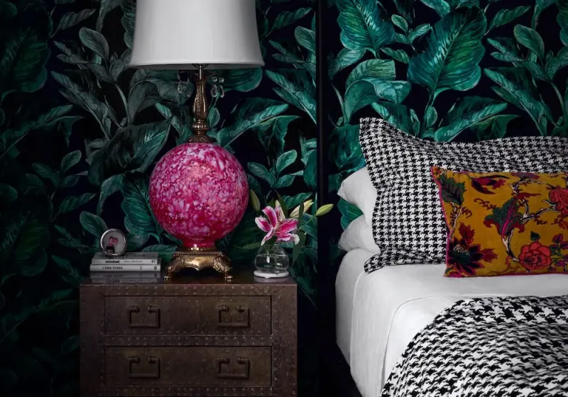
Table of Contents
If you want the highest return on any design dollar, paint is where I send clients first. New furniture is wonderful, but a considered paint color changes the way a whole room feels, and your mood inside it. After nearly two decades designing luxury homes across Austin, these are the paint colors I return to again and again, plus how I choose them room by room.
One rule before the list: never commit to a color from a website swatch or a tiny paper chip. Buy a sample, paint a large piece of poster board or a two foot square directly on the wall, and live with it for a few days. Look at it in morning light, afternoon light, and lamplight. Luxury is in the detail, and paint is the detail people feel before they can name it.
The short version: the colors that consistently read as luxurious are disciplined ones. Clean warm whites, deep saturated moody tones, and soft champagne neutrals, chosen for the light in your specific room. My most requested are Benjamin Moore Decorator’s White, Black Forest Green, and Boudoir at fifty percent.
Ready To Elevate Your Home's Palette
What Makes a Paint Color Look Luxurious
Expensive looking color is less about the shade and more about restraint and depth. A few principles guide every palette I build.
- Luxury leans into depth. Flat, one note colors feel builder grade. Colors with a little complexity, a green that carries black, a white with a warm undertone, catch light and shadow and feel richer.
- Luxury is quiet, not loud. The most elevated rooms usually rest on a tight palette, one dominant color, one supporting tone, and a single accent, rather than many competing colors.
- Luxury respects the light. The same color can look crisp in a north facing room and golden in a west facing one. In our Austin projects, where the Hill Country light runs bright and warm most of the year, I always test on the actual wall before I specify anything.
My Go To Luxury Whites and Warm Neutrals
Whites and warm neutrals are the foundation of almost every luxury home I design. They are also the hardest to get right, because the wrong undertone can turn a room cold or dingy.
Benjamin Moore Decorator’s White
A clean, cool leaning bright white that I use constantly on trim, millwork, and walls when a client wants a fresh, gallery-like backdrop. It lets art, stone, and furnishings take center stage. Because it reads cool, it pairs beautifully with cooler grays and with high contrast moody colors. In rooms with warm afternoon light, it stays crisp rather than yellowing.
Benjamin Moore White Dove
When I want warmth instead of crispness, White Dove is my default. It’s a soft, warm white with the gentlest undertone, so it feels calm and inviting rather than stark. It’s forgiving across many lighting conditions, which makes it a safe, elegant choice for open floor plans where one color flows through several rooms.
Benjamin Moore Boudoir at Fifty Percent
One of my signature picks. At full strength Boudoir is a warm blush, but knocked back to fifty percent it becomes a champagne neutral that balances softness and sophistication. It’s wonderful on an accent wall, in a powder room, or wrapping a primary bedroom for a restful, quietly feminine feel. It flatters warm metals like brass and gold especially well.
Go To Moody and Dramatic Luxury Colors
Deep color is how you give a room presence. These are the saturated tones I reach for when a client wants drama, intimacy, or a jewel box moment.
Benjamin Moore Black Forest Green
A deep, historic green with real sophistication. I love it in studies, dining rooms, and powder rooms where you want an enveloping, dramatic mood. It is a chameleon that pairs gorgeously with marble, gold accents, and warm woods, which is why it photographs so beautifully. Pair it with brass hardware and natural stone and the room instantly feels collected and expensive.
Benjamin Moore Hale Navy
If green is not the client’s language, navy is the classic alternative. Hale Navy is rich and grounded without going flat, and it is the perfect partner for gold and brass. A navy and gold pairing brings a regal, high contrast elegance that never feels trendy. It suits a formal dining room, a library, or built-in cabinetry you want to feel like furniture.
A True Near Black
For the boldest rooms I turn to a soft near black like Benjamin Moore Soot or a charcoal with a hint of blue. Painting walls, trim, and ceiling in the same deep tone, a technique called color drenching, erases the edges of a room and makes it feel like a cocoon. It’s my go to for dark, moody bedrooms and intimate media rooms.
Luxury Paint Colors by Room
The right color depends on how a room is used and the light it receives. Here is how I approach the spaces clients ask about most.
Formal Dining Room
Dining rooms are used mostly in the evening, so they can carry deeper, warmer color than you would dare elsewhere. Black Forest Green, Hale Navy, or a warm oxblood feel intimate and elevated under candlelight and warm bulbs. These are rooms where drama pays off.
Dark and Moody Bedroom
For a restful, enveloping bedroom, I color drench in a soft near black, a deep charcoal, or a smoky blue green. Keep bedding and drapery tonal so the room reads calm rather than heavy, and let texture do the work.
Warm and Inviting Bathroom
In bathrooms clients want warmth and calm. Soft warm neutrals like White Dove or a gentle greige feel clean without going cold. For a spa-like bathroom, a muted soft blue green such as Benjamin Moore Palladian Blue reads serene and current while still feeling timeless.
Accent Walls
An accent wall is a low commitment way to introduce luxury. Boudoir at fifty percent, a deep green, or a warm plaster tone behind a bed or in a niche adds depth without committing the whole room.
You can see how these palettes come together across our portfolio of Austin interior design projects, where paint sets the tone before a single piece of furniture arrives.
How to Choose Luxury Paint Colors for Your Home
Clients often ask how I choose modern paint colors that will still feel right in ten years. My process is simple and worth copying.
- Start with the room’s light and purpose, not a color you saw online. A north facing room needs warmth added back. An evening room can go dark. Once you know the light, pull three to five candidates and sample them large.
- Build from a whole home palette rather than one room at a time. Choosing colors that relate to each other, a consistent white, a couple of deeper tones that repeat, is what makes a home feel cohesive and considered rather than piecemeal.
- Anchor every palette to your fixed finishes. Your stone, wood floors, cabinetry, and metals are not changing, so let them lead. The best paint color is the one that makes everything already in the room look better.
When in doubt, go quieter and deeper rather than brighter. Saturated, restrained color almost always reads more expensive than a busy or high chroma one.
Frequently Asked Questions
What paint colors look the most luxurious?
Disciplined, layered colors: clean warm whites like Benjamin Moore White Dove, deep saturated tones like Black Forest Green or Hale Navy, and soft champagne neutrals like Boudoir at fifty percent. Restraint and depth read as luxury more than any single trendy shade.
How do I choose modern paint colors that will not date?
Start with your room’s natural light and fixed finishes rather than a trend, keep the palette tight, and lean toward deeper, restrained tones. Sample every color large and view it morning, afternoon, and evening before committing.
What are the best dark and moody bedroom paint colors?
Soft near blacks, deep charcoals, and smoky blue greens create a restful, enveloping feel. Color drenching the walls, trim, and ceiling in one deep tone makes the room feel intimate and considered.
What formal dining room paint colors feel warm and inviting?
Because dining rooms are used at night, deep greens like Black Forest Green, rich navies like Hale Navy, and warm oxbloods feel intimate and elevated under candlelight and warm bulbs.
What bathroom paint colors feel warm and spa like?
Soft warm neutrals such as White Dove keep a bathroom calm and clean, while a muted soft blue green like Palladian Blue reads serene and spa like without feeling cold.
Let a Luxury Designer Build Your Palette
The right paint colors do quiet, powerful work. They set the mood of a home, flatter everything in it, and cost far less than most people expect for the impact they deliver. If you would love a palette chosen for your light, your finishes, and the way you live, I would be glad to help.
Fisher Interiors is an Architectural Digest approved luxury interior design studio in Austin, TX, offering full service residential design, styling, and remote design consultations for clients beyond Austin.
Book a discovery call and let us design a home that feels like you.
Project Feature: Downtown Austin Loft
Maximizing scale and style in the city. We transformed this downtown loft by balancing its raw architectural bones with plush, sophisticated materials and iconic vintage elements.
It’s a striking example of how a modern concrete space can feel incredibly warm, soulful, and tailored to the individual.
Step Inside the Loft