J.Fisher Interiors · Austin, Texas
What Colors Make Gold? A Luxury Designer’s Guide to Mixing, Pairing, and Styling Gold
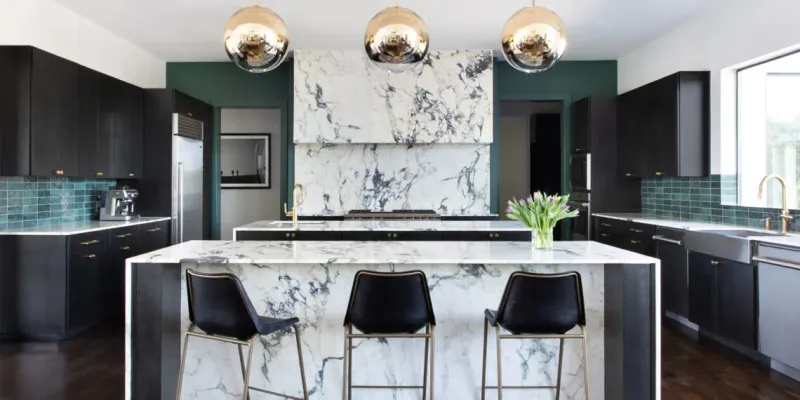
Table of Contents
Gold is one of the most requested finishes in the luxury homes we design across Austin, and it’s also one of the most misunderstood. Ask ten people what colors make gold and you will get ten answers, because gold is not a single pigment you buy in a tube. It’s a warm yellow built from a careful balance of hue, depth, and light. Get that balance right and a room feels layered and expensive. Get it wrong and gold reads as flat mustard or cheap plastic.
After nearly two decades of specifying paint, finishes, and metals for high end residences, I want to give you the same answer I give clients. This guide covers exactly what colors mix to make gold, how to shift the shade toward rose gold or antique gold, which colors make gold stand out in a room, and how we use all of it inside real Austin interiors.
The short answer: gold starts with yellow and brown. Mix roughly two parts yellow to one part brown for a classic gold, then adjust with small amounts of red, white, or a touch of metallic medium to reach the exact tone you want.
Ready To Elevate Your Home's Palette
What Colors Make Gold: The Core Formula
Gold is a tertiary color. You build it from a warm base and then control its temperature and depth. The foundation is simple.
Start with yellow as your base color. Yellow carries the brightness that makes gold glow. Add brown to give it richness and that grounded, metallic weight. Brown is what separates real gold from a plain sunny yellow. On its own, yellow looks like lemon or butter. Yellow plus brown begins to look like a precious metal.
My reliable starting ratio is two parts yellow to one part brown. From there you tune it:
- For a brighter, lighter gold, add a little white to open it up.
- For a deeper, richer gold, add a touch more brown or a whisper of black. Go slowly, because dark pigment takes over fast.
- For warmth and a rose leaning tone, add a small amount of red or orange.
If you do not have brown on hand, you can make it by mixing the three primary colors (red, yellow, and blue) together, then bias the mix back toward yellow. This is why people often ask what primary colors make gold. Technically gold traces back to yellow with red and blue combining to create the brown that deepens it.
My Go To Gold Mixing Ratios
These are the recipes I return to again and again when we develop custom finishes for a project.
- Classic gold: 2 parts yellow, 1 part brown.
- Rose gold: start with a classic gold base, then add pink or coral in small increments until you reach a soft blush warmth.
- Antique or old gold: yellow with an olive undertone, achieved by adding the smallest touch of green or a muted brown.
- Metallic gold: yellow plus a light brown, finished with tiny touches of silver or a metallic medium to catch the light.
- Pale or champagne gold: a yellow base opened up with white until it turns soft and luminous.
Keep notes as you go. Mix in consistent measurements, write down what you added, and let each sample dry before you judge it. Wet paint always looks darker and richer than the dry result, and gold is especially sensitive to that shift.
Why Gold Looks Different in Every Room: The Role of Light
Here is the part most tutorials skip, and it’s the part that matters most in a real home. Gold is not a fixed color. It’s a conversation between pigment and light, which is why the same swatch can look buttery in one room and brassy in another.
Natural daylight tends to reveal the true warmth of gold and honestly shows off its yellow base. LED lighting, depending on its color temperature, can pull gold toward a cooler, sharper look. Incandescent bulbs enrich gold and deepen its glow. Halogen creates crisp, bright reflections that make metallic golds sparkle.
The direction of light matters too. North facing rooms receive cooler, softer light, so a gold that looks perfect on your work table can turn slightly gray on the wall. South and west facing rooms flood with warm light, which can push a rich gold toward orange by late afternoon.
Before we commit to any gold finish, we test large samples on multiple walls and view them in the morning, midday, and evening. In our Austin projects, where the Hill Country light is bright and warm for most of the year, this step is not optional.
What Colors Make Gold Stand Out and Pop
Mixing the right gold is only half the work. The colors around it decide whether it reads as refined or gaudy. This is where color theory earns its keep, and it answers a question we hear constantly: what color makes gold pop?
Complementary Colors: Deep Blue and Purple
The strongest partner for gold sits opposite it on the color wheel. Deep navy blue paired with gold accents brings a regal, high contrast sophistication that instantly feels considered. Purple and eggplant tones do similar work with a moodier, more dramatic result. Because the contrast is so strong, use gold as the accent rather than the dominant color. A useful guide is to let the cool tone lead and keep gold to roughly twenty percent of the palette.
Analogous Colors: Warm Reds, Oranges, and Creams
For a softer, more enveloping feel, pair gold with its neighbors on the color wheel. Warm oranges, terracottas, rich reds, and creamy off whites let gold blend into a cohesive, glowing scheme rather than jumping out. This approach suits bedrooms, libraries, and dining rooms where you want warmth and intimacy instead of sharp contrast.
Neutrals That Let Gold Breathe
Gold also shines against controlled neutrals. Soft grays, warm whites, charcoal, and natural stone give gold room to be the star without competing. In many of our Austin homes we pair gold with cool stone textures and plaster walls, which reflects the Hill Country aesthetic and keeps the look grounded rather than flashy.
How We Use Gold in Luxury Interiors
Knowing what colors make gold is useful. Knowing how to use gold and metallic tones in a luxury palette is what makes a home feel designed. These are the principles we apply on real projects.
Layer Different Gold Finishes
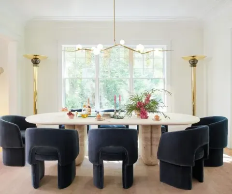
Polished, brushed, and antique golds each catch light differently. Combining two or three finishes in one room adds depth and reads as collected over time rather than bought in a single trip. A polished gold light fixture, brushed gold hardware, and an antique gold mirror frame can live together beautifully.
Follow the 60/30/10 approach
Keep your dominant color at around 60% of the room, your secondary color at 30%, and gold as the 10% accent that ties everything together. This keeps gold feeling intentional and luxurious instead of overwhelming.
Place Gold Where Light Will Work for It
A gilded frame or metallic accent positioned near a window or a considered light source will glow through the day. Tucked into a dark corner, that same piece falls flat. We plan gold placement around the light in a room, not the other way around.
Match Gold to the Room’s Purpose
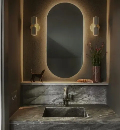
In a powder room, gold fixtures and a gilded mirror create a jewel box moment. In a living room, gold works best in measured doses through lighting, frames, and hardware. In a kitchen, warm gold hardware against stone or deep cabinetry brings quiet warmth. In a primary bedroom, soft champagne golds feel restful rather than loud.
Balance the Temperature
Because gold is warm, a room built entirely of warm tones can feel heavy. Introduce a cool counterpoint, a slate blue, a cool gray, a natural greenery, to keep the space balanced and let the gold feel like a highlight.
You can see these ideas at work across our portfolio of Austin interior design projects, from the layered metals of Silver Hill to the warm, light filled rooms of our Lake Austin remodel.
Common Gold Mixing Mistakes to Avoid
A few missteps come up over and over, whether you are mixing paint or choosing finishes.
- Adding dark pigment too fast. Brown and black deepen gold quickly and are hard to walk back. Build depth in small increments.
- Ignoring undertones. An unwanted green or gray undertone can creep in from the wrong brown or from cool lighting. Test your mix against the actual wall and the actual light before committing.
- Chasing true metallic shine with flat paint. Pigment alone cannot fully replicate the reflective sheen of real gold. If you want genuine luster, reach for a metallic medium or a specialty metallic paint rather than piling on more yellow. Our guide to choosing the best metallic gold paint for walls walks through the products we trust.
- Testing under only one light. Gold changes character through the day. Judge it in morning, afternoon, and evening light before you decide.
Frequently Asked Questions
What two colors make gold?
Yellow and brown. Mix about two parts yellow to one part brown for a classic gold, then adjust with white to lighten or a touch of red for warmth.
What primary colors make gold?
Gold is built on yellow. Red and blue combine to create the brown that gives gold its depth, so all three primaries play a part, with yellow leading.
How do you make rose gold?
Start with a classic gold base of yellow and brown, then add small amounts of pink or coral until you reach a soft, warm blush tone.
What color makes gold pop?
Deep navy blue is the standout choice because it sits opposite gold on the color wheel. Purple, charcoal, and crisp white also make gold stand out.
What colors make gold paint look metallic?
Pigment alone will not create true shine. Mix your gold from yellow and light brown, then add a metallic medium or silver accents so the finish catches and reflects light.
Why does my gold look more like mustard or brown?
You likely added too much brown or dark pigment. Reintroduce yellow to brighten it, and add a small amount of white to lift the tone.
Bring Gold Into Your Home the Right Way
Gold rewards restraint and punishes guesswork. The colors that make gold are simple, yellow and brown at the core, but the artistry is in the balance, the pairings, and the way you plan for light. Done well, gold gives a room the warmth and quiet luxury that photographs beautifully and feels even better in person.
If you would love gold woven through your home with a designer’s eye, we would be glad to help. J. Fisher Interiors is an Architectural Digest approved luxury interior design studio in Austin, TX, offering full service residential design, styling, and remote design consultations for clients beyond Austin.
Book a discovery call and let us design a space that feels like you.